Website redesign for a regulated B2B software solutions
Finture's site had grown organically and no longer matched the company's enterprise positioning – the visual identity was intact, but the information architecture reflected internal structure rather than what a client actually needed to decide to trust the product. I led the redesign from research through implementation, shipping page-by-page against a live, in-production site.
UX/Product design & development
AI-assisted prototyping · WordPress · Elementor · Plausible · Clarity
May 2026 – present
enterprise finance
regulated markets
B2B SaaS
design systems
ongoing
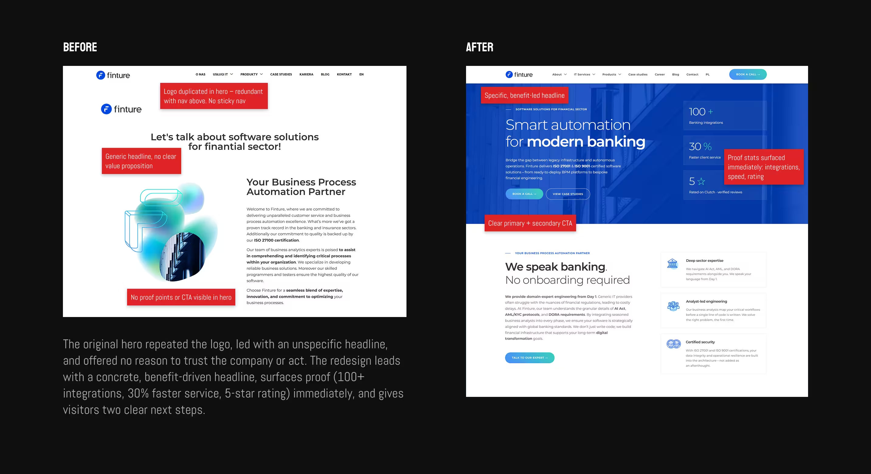
The brief was a refresh, not a rebrand – typography and color stayed, but the architecture and content had to be rebuilt. I ran competitive benchmarking against other enterprise finance platforms and current B2B SaaS trends, audited existing content for gaps and duplication, and reviewed Plausible and Clarity to see where visitors were actually dropping off.
Because the product sits in a technical, regulated space, accurate positioning depended on more than a content audit. I worked directly with internal subject-matter experts to understand what the product does at a level deep enough to describe it correctly – a necessary step whenever design has to communicate a domain it doesn't originate from.
Navigation reflected internal team structure, not how a prospective client actually thinks about the decision.
Differentiators that mattered most to enterprise buyers – compliance, track record – were present but hard to find.
Visual inconsistency across pages was quietly undercutting how mature and trustworthy the products and services appeared.
There wasn't time for full Figma wireframes on every page, so I adopted an AI-first workflow: prompting for structural direction, generating a working prototype, then refining and building live in Elementor. This is a deliberate method for a fast-moving in-house context, not a shortcut around research – every prototype was still checked against the IA and content decisions from discovery before it shipped.
Research
IA
AI prototype
UI
Design system
Build
Accessibility
Measure
Built a cohesive, multi-dimensional design system with a clear component hierarchy inside the existing brand constraints. Because the site ships page-by-page rather than as one relaunch, the system had to be strict enough that new pages slot in without visual drift.
Typography scale
Component library
Spacing rules
Card patterns
Navigation
Form states
Built into the redesign as standard, not an afterthought:
The redesign is rolling out incrementally rather than as one relaunch. Pages already live are tracked in Plausible and Clarity, and the pattern is consistent: fewer visitors left immediately, the ones who stayed engaged with more of the site, and average time on page rose accordingly.
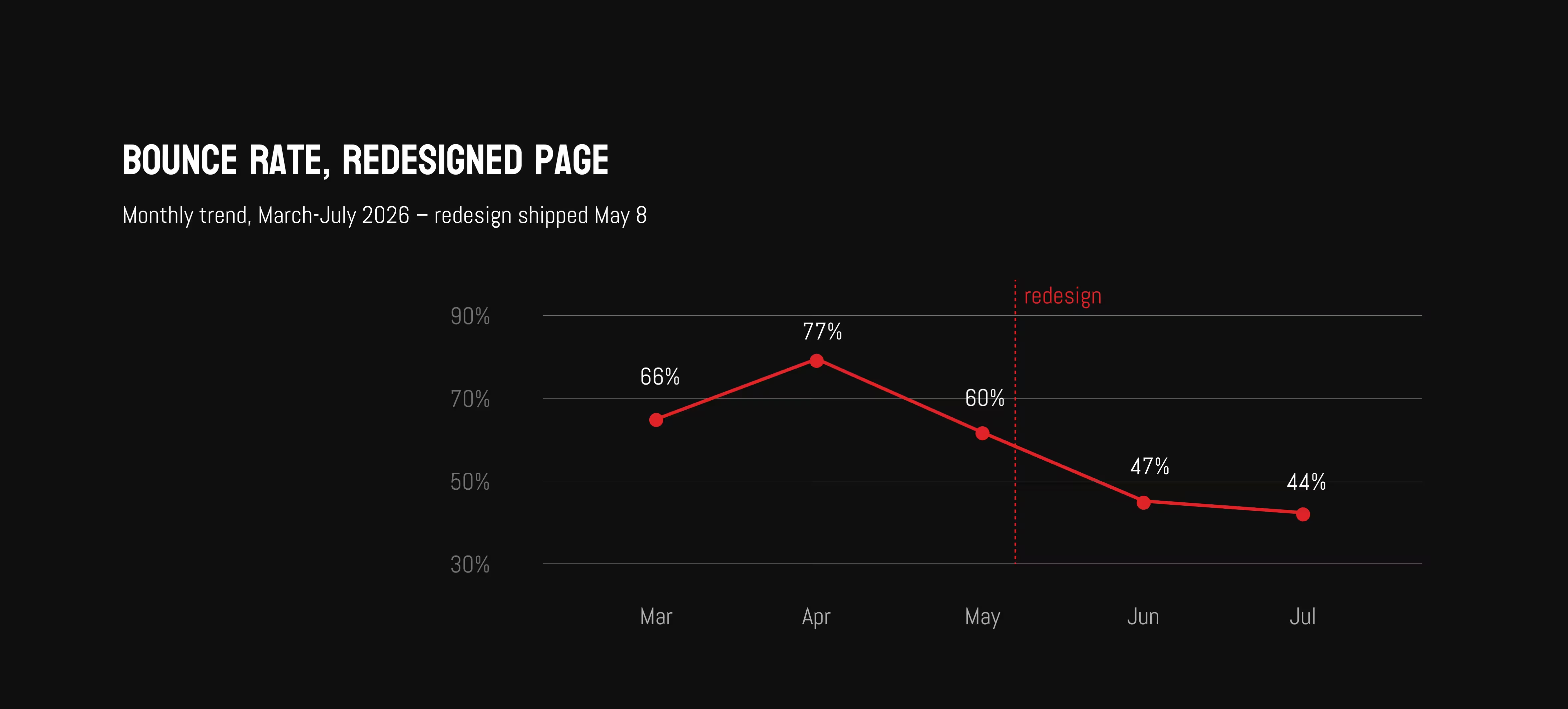
bounce rate on the redesigned pages
average visit duration
page views per visit
shared design system now driving every new page shipped
finture.com

© Agata Czerniak 2026



.svg)


